What's new in Gutenberg 14.9? Gutenberg 14.9 has been released

What's new in Gutenberg 14.9? (January 4)

The original English source of the article - gutenberg-new - Make WordPress Core - translation into Hungarian

"What's new at Gutenberg..." in posts (#gutenberg-new tagged) are published every two weeks after each Gutenberg edition, showing the new features in each edition. Reminder:, here it is an overview of how to keep up with Gutenberg and the Site Editor project (formerly known as Full Site Editing).

What's new in Gutenberg 14.9? Gutenberg 14.9 has been released

Gutenberg 14.9 was released, which downloaded from!

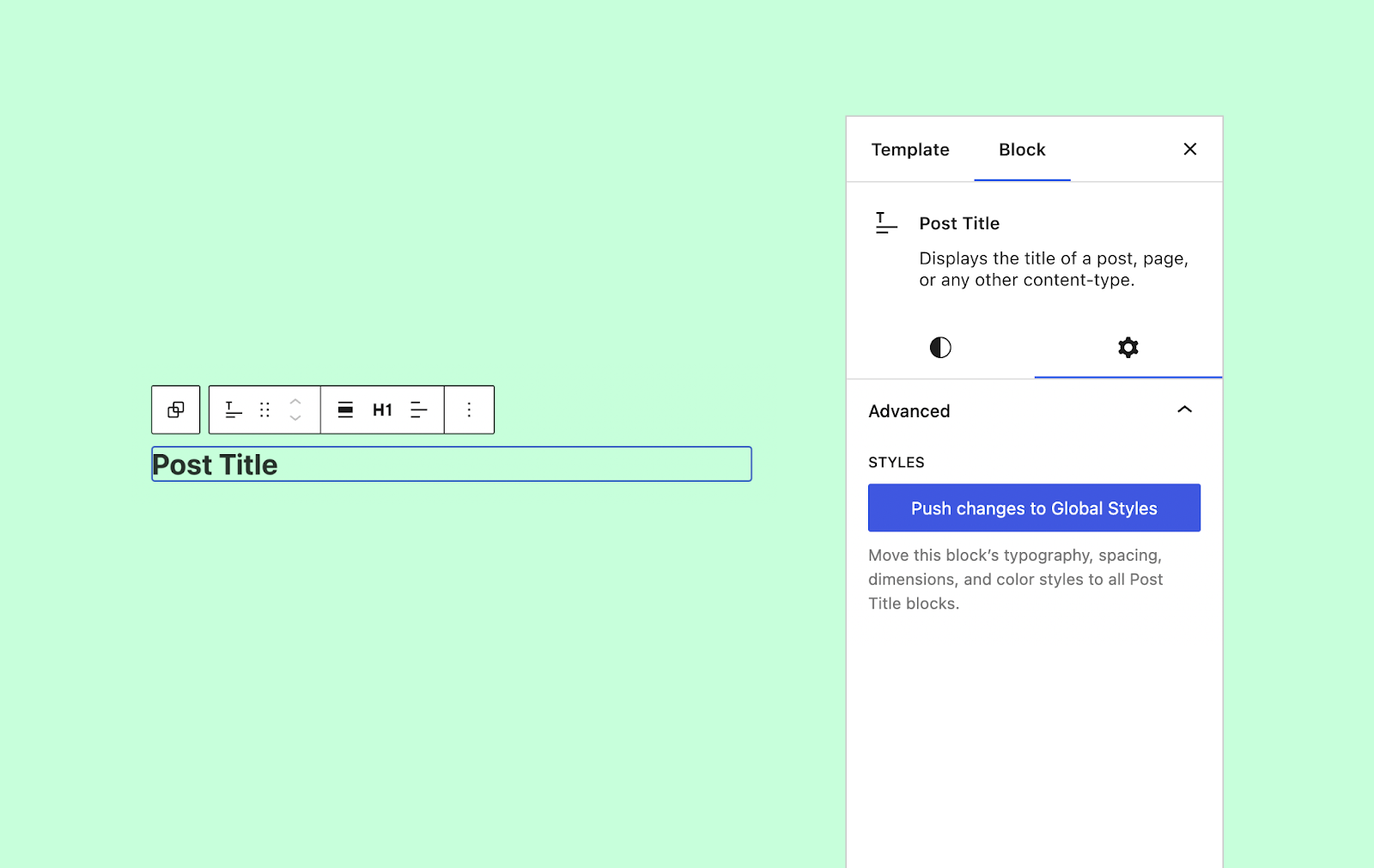
    Push block modifications in global styles

    Gutenberg 14.9 introduces a new button called Push changes to Global Styles in the special panel for each block. This allows users to make changes while editing a template in the In Site Editor, but these changes are applied globally. The new feature makes it much easier to maintain a consistent design without having to edit separate templates.46446)

    WordPressWhat's new in Gutenberg 14.9? Gutenberg 14.9 releasedPush block modifications to global styles

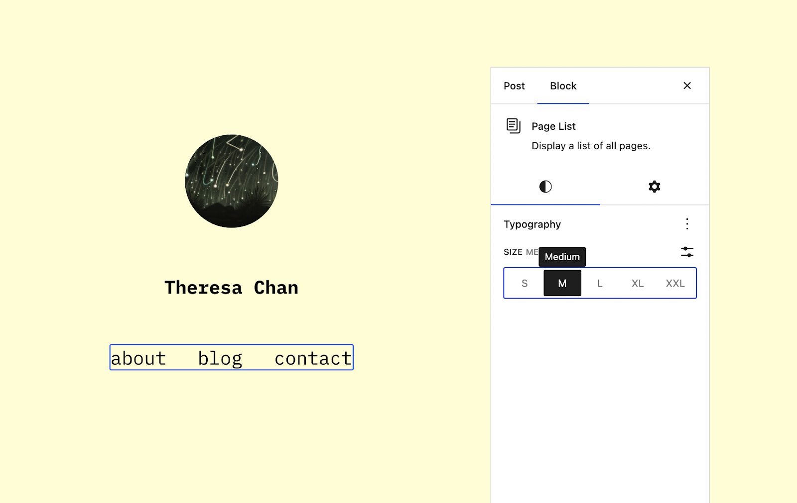
    Typographical support for the sidebar block

    The Oldallista block now supports all typographic settings, including font size, family and more. This change is part of a larger effort to create consistent design tools across all core blocks.43316)

    WordPress GutenbergTypographic support for the page list blockGutenberg 14.9 released

    Import sidebar widgets into template parts

    When inserting a new template part into a template in the Site Editor, users can now import widgets from a previously registered dynamic sidebar. This is a transitional tool to help users move from classic theme settings to blocks without losing the visit their website invested in their work. (45509)

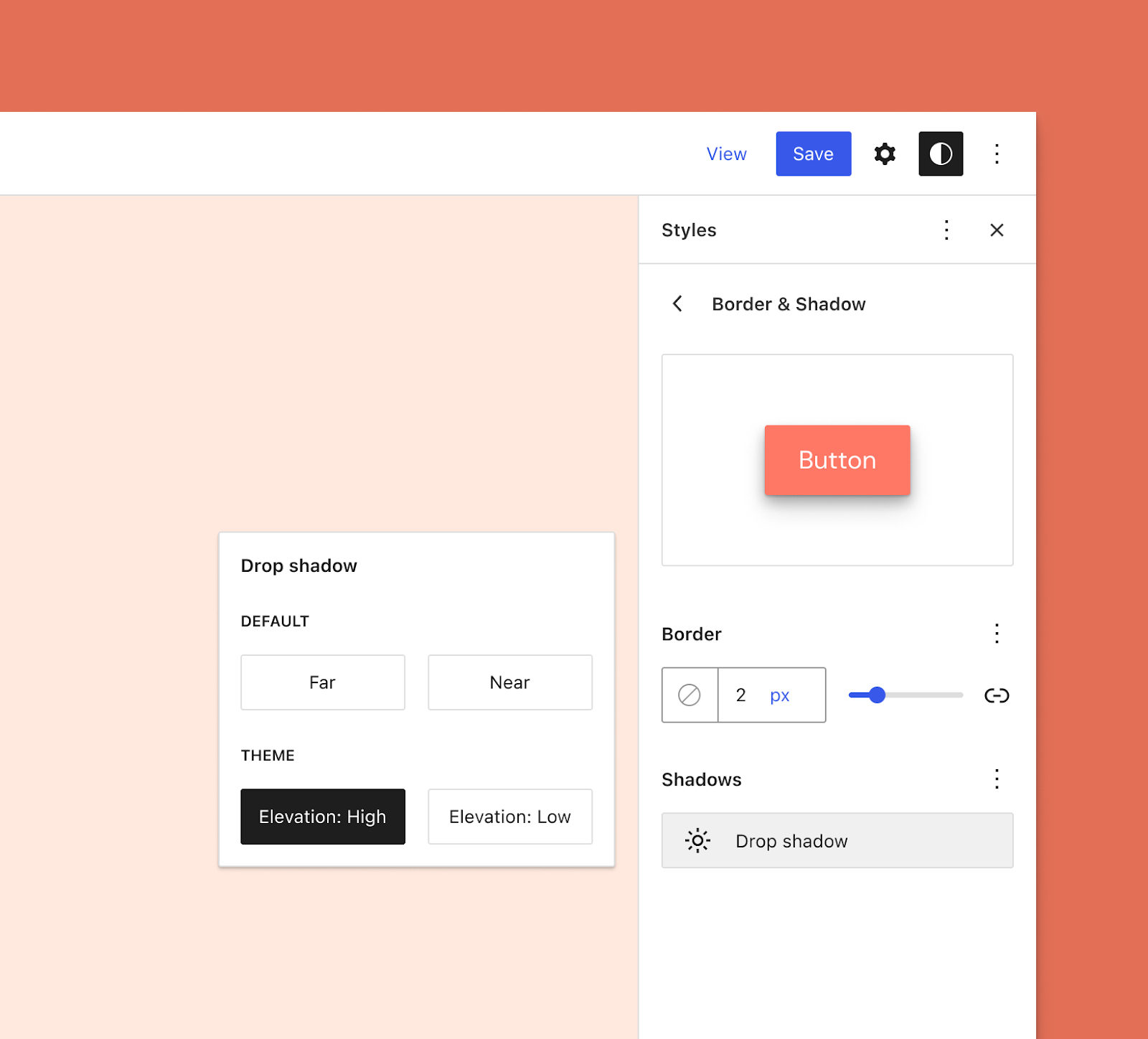
    Topic. JSON support: shadow sets and minimum liquid font size

    A WordPress theme authors can now choose the new box-shadow feature, creating a set of custom presets to use in their designs. This system works in a similar way to colours, colour transitions and other optional design tools.46813)

    Currently, the user interface that would allow user overrides for this feature is still under development. However, the screenshot below gives a preview of what it could look like:

    Original English source: gutenberg-new - Make WordPress Core

    Import sidebar widgets into template sectionsGutenberg 14.9WordPress style editor that displays the Border & Shadow section in the sidebar.  It displays a preview of a button with a dark shadow behind it.

    Theme designers who use the built-in fluid typography in theme.json can now set the minimum font size using settings.typography.fluid.minFontSize. By default, the minimum is set to 14px, but this is not ideal for all designs. With this new setting, developers can better control the handling of fluid typography.42489)

    Other notable changes

    The previous Gutenberg release (version 14.8) introduced the new Site Editor sidebar, which is the hub for navigating through the sections of the site. Version 14.9 continues the iteration of this feature. The sidebar now displays the template title and type with a context-sensitive edit button next to them. The sidebar width has also been increased, giving its contents a bit more breathing room (46736), (46769), (46700)


    Developers can now register patterns for certain template types, limiting where patterns appear. For example, an Error 404 pattern would only make sense if used with a 404 template.45814)

    If you like what you read here, share it with others! Thank you!

    Facebook
    LinkedIn
    Twitter
    Pinterest
    Email
    Print

    See also our other articles:

    Responsive Mobile Friendly Website / Responsive WebDesign- Typography, PX, EM, REM, %, VW, VH em rem vs px ; elementor px em rem ; px em rem vw ; elementor use ; elementor px em rem vw ; rem vs vh ; px vh ; css vw ; px vh vw elementor ; em rem px vw vh ; em rem css ; pixel image creation ; em rem px vw vh ; vh vs vw ; px vh vw elementor ; rem vs pixels ; 24px to rem ; em rem vh vw in css ; em webdesign ; px rem em vh vw ; vw em ; px to vw ; rem css ; rem vs em vs vh ; vh px em ; vh vs vw ; vh vs px ; vw elementor ; vw em ; vw rem ; vw to px ; rem vs pixels ; vw to px ; webdesign elementor ; webdesigner elementor ; web design elementor ; vw vs rem ; px em vw rem vs px ; px vs em vs rem vs vh ; responsive design ; responsive design ; responsive design ; responsive web design css vw ; css px em rem vh vw ; rem elementor ; rem web design ; css rem vw ; em rem vw vh ; responsive website design ; responsive website design elementor px vh vw ; responsive web development ; responsive website; responsive web development ; responsive website elementor course ; responsive web development ; responsive web design ; responsive web design ; responsive web design ; responsive web design ; responsive website ; responsive website design ; responsive website design ; responsive website design ; responsive website design ; responsive website design ; responsive website creation ; responsive website design ; responsive website design ; responsive website design ; responsive website

    Responsive Mobile Friendly Website / Responsive Web Design- Typography, PX, EM, REM, %, VW, VH

    Responsive Website / Responsive WebDesign - What does it mean? - Typography (PX, EM, REM, %, VW, VH)

    em rem vs px ; elementor px em rem ; px em rem vw ; elementor use ; elementor px em rem vw ; rem vs vh ; px vh ; css vw ; px vh vw elementor ; em rem px vw vh ; em rem css ; pixel image creation ; em rem px vw vh ; vh vs vw ; px vh vw elementor ; rem vs pixels ; 24px to rem ; em rem vh vw in css ; em webdesign ; px rem em vh vw ; vw em ; px to vw ; rem css ; rem vs em vs vh ; vh px em ; vh vs vw ; vh vs px ; vw elementor ; vw em ; vw rem ; vw to px ; rem vs pixels ; vw to px ; webdesign elementor ; webdesigner elementor; web design elementor ; vw vs rem ; px em vw rem vs px ; px vs em vs rem vs vh ; responsive design ; responsive design ; responsive web design ;css vw ; css px em rem vh vw ; rem elementor ; rem web design ; css rem vw ; em rem vw vh ; responsive website design ; responsive website development ; elementor px vh vw ; responsive web development ; responsive website ; responsive web design ; responsive website ; elementor course ; responsive web development ; responsive web design ; Responsive web design ; responsive web design ; responsive web design ; responsive website ; mobile friendly website design ; mobile friendly website design ; website design ; responsive website design ; responsive website ; responsive website design ; responsive website ; rem vs pixels em rem px vw vh ; elementor px em rem vw ; em rem px vw vh ; rem vs pixels;

    Read more "
    Free Website, Free Website, Free Website - webserve, olcsowebsite.hu

    Website for free (0 USD) !?

    Free Website, free Website, free Website even from your own resources (0 Ft) !? Updated: 1 Feb 2023 Yes, there are many solutions to choose from, where you can get a website for free or at least

    Read more "
    SEO Basics 2022-2023 - A Beginner's Guide - webserve.hu

    SEO Basics 2022-2023

    What is SEO? Why SEO is important?Search engine optimisation the smart way.
    Why is SEO so important?
    First of all, it is free, unlike advertising.
    SEO stands for Search Engine Optimization, or search engine optimization.
    What type of content people want or need.
    How search engines work.

    Read more "
    en_USEnglish
    Newsletter subscription

    Newsletter subscription

    To be informed only about what you want to know.

    Successful subscription!

    Stay longer! :)

    With a gift we are waiting!
    Want to be more successful?

    Válasszon weboldal készítési kedvezmény vagy ingyenes weboldal mini audit közül.
    Írja meg itt, melyiket szeretné.