
Responsive Mobile Friendly Website /
Reszponzív Mobilbarát Web Design készítés
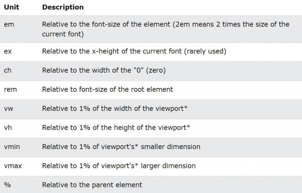
What is the difference between (Pixel) PX, EM, REM, %, VW and VH? – Viewport…
What is the purpose of this writing? And why is a responsive website important?
I myself used to struggle with responsiveness, mobile presence (even today I still often have some trouble ;), what units to use and what they mean...
The following document contains the most important information in one place. Which may help you to understand or clarify the units of responsiveness typography and visual layout associated with web pages, their naming, meaning and function.

Style settings in CSS or WordPress Website Creation case. For example: for Elementor or any page builder
Our example of the WordPress Website Creation shows the differences, but they are perfectly true for all kinds of Web development and Web design solutions related to websites. We use the same logic and naming conventions for HTML and CSS. In this respect, we are talking about knowledge that is also applicable to universal look and style.
The theme above WordPress and Elementor, is presented along the example of one of the most popular website builders. It looks very similar to the also popular Divi website builder also for.
PX, EM, REM, %, VW, VH
Website creation you may notice that some elements have sizing options that allow the use/selection of PX, EM, REM, %, VW or VH. Proper use of the above is one of the basic principles of responsive websites. But what do these options actually mean, and when should you use one instead of the other?
For this let's start with the basics – CSS, Styles, Style settings, Margins typography and more
In CSS, you can specify the size or length of elements using different units of measurement. Some of the units of measurement available in Elementor options include PX, EM, REM, %, VW and VH, although there are many others available in CSS. Not all Elementor options offer all of these units. For example, the Divi or the Elementor shows only the options that make the most sense to apply to the item.
The most important aspect of understanding the different units is that some units, such as PX, are absolute units, while others are relative units.
Absolute units
PX = Pixel, DPI, Fixed unit
Pixels (px) are an absolute unit, although they are relative to the DPI and resolution of the display device. On the device itself, however, the PX unit is fixed and does not change based on any other element. Using PX can be problematic for responsive websites, but it is useful for maintaining consistent scaling of some elements. If you have elements that should not be resized, then using PX is a good choice.
Relative units (EM, REM, %, VW VH)
EM:
Relative to the parent element
REM:
Relative to the root element (HTML tag).
%:
Relative to the parent element
VW:
In relation to the width of the viewport.
VH:
Relative to the height of the viewport.
Unlike pixel, PX, relative units such as %, EM and REM are better suited to responsive design and also help meet accessibility standards. Relative units scale better across devices because they can scale up and down according to the size of another element.
Let's look at a simple example.
The default font size in most browsers is 16px. Relative units calculate the size from this base. If you change this base by adjusting the base size of the HTML tag using CSS, this will be the basis for calculating the relative units for the rest of the page. Similarly, if the user sets the font size, this will be the basis for calculating the relative units.
So what do these units mean when it comes to the default 16px?
The number you enter will multiply this number by the default size.
1em = 16px (1 * 16)
2em = 32px (2 * 16)
0.5em = 8px (0.5 * 16)
1rem = 16px
2rem = 32px
0.5rem = 8px
100% = 16px
200% = 32px
50% = 8px
OK, but what if you or the user changes the default size? Since these are relative units, the final size values will be based on the new default size. Although the default is 16px, if you or the user change it to 12px, the calculated sizes would be as follows:
1em = 12px (1 * 12)
2em = 24px (2 * 12)
0.5em = 6px (0.5 * 12)
1rem = 12px
2rem = 24px
0.5rem = 6px
100% = 12px
200% = 24px
50% = 6px
This gives the user the freedom to set the browser's default font size, while maintaining the relative proportions of each element you specify.

What is the difference between EM and REM?
Looking at the diagram above, EM and REM look exactly the same. So how do they differ?
Put simply, they differ according to heredity. As mentioned, REM is based on the root element (HTML). All child elements that use REM use the HTML root size as the calculation point, regardless of whether or not a different size is specified in the parent element.
h1 {
  font-size: 60px;
}

p {
  font-size: 25px;
  line-height: 50px;
}

*Source: https://www.w3schools.com/css/css_units.asp
EM is based on the font size of the parent element. If a parent element has a different size than the root element, the EM is calculated based on the parent element, not the root element. This means that embedded elements that use EM for sizing may sometimes have a size that was not expected. On the other hand, it provides finer control when the size of a particular area of the page is to be specified.
<!DOCTYPE html>
<html>
<head>
<style>
h1 {
  font-size: 4rem;
}

p {
  font-size: 2em;
  line-height: 2rem;
}
</style>
</head>
<body>

<h1>This heading 1</h1>
<h2>This heading 2</h2>
<p>This is a paragraph</p>
<p>Another paragraph</p>

</body>
</html>
What about %, VW and VH values? What are they about?
While PX, EM and REM are mainly used for font sizing, %, VW and VH are mostly used for margins, padding, spacing and width/height.
(For those interested, here is a Pixel / EM converting prpgram)
Again, the VH is the "viewport height", i.e. the height of the screen that can be displayed. 100VH is 100% of the viewport height, i.e. the total height of the screen. And of course, VW is "viewport width", which is the visible width of the screen. The 100VW would be 100% of the viewport width, i.e. the total width of the screen. The % reflects the percentage of the size of the parent element, regardless of the size of the viewport.
Let's look at some examples of where Elementor gives %, VW and VH options.
Column Widths: for example, when editing the layout of an Elementor column, you may notice that there is only one width scaling unit available - %. Column widths only work well and responsively when using percentages, so no other options are given.
Indentation or Padding: the padding of the section can be specified in PX, EM or %. As with margins, it is often preferable to use EM or % so that padding remains relative as the page size increases.
Font size: when you edit the typography of an element, such as a headline, you will see four options to choose from: PX, EM, REM and VH.
Have you ever created a large header, admired how good it looks on desktop, then realised it's too big on mobile (I have, more than once :).

The key to this elegant solution is to use EM, REM or VW instead of PX. Which one you choose depends on your specific situation. I usually choose EM because I want the size to be relative to the parent of the title bar. However, if you want the size to be relative to the size of the root (HTML), then you should choose REM instead. Or you can set it to be relative to the width of the viewport (VW) if that works better for you.
Note that you can also set the font size PX values per device by using the Device icons to set the desktop, tablet and mobile sizes. However, this will still limit responsiveness and accessibility, so keep this in mind if you choose PX.
More information about VW and VH
Viewport units are a percentage of the current viewport (current browser size) of the browser. Although similar to % units, there is a difference. Viewport units are calculated as a percentage of the browser's current viewport size. Percentage units, on the other hand, are calculated as a percentage of the parent element, which may be different from the viewport size.
Take an example of a 480px x 800px mobile screen viewport.
1 VW = 1% of the viewport width (or 4.8px).
50 VW = 50% of the viewport width (or 240px)
1 VH = 1% of the viewport height (or 8px)
50 VH = 50% of the viewport height (or 400px)
If the size of the viewport changes, the size of the element changes.
When should one unit be used over another?
Ultimately, there is no perfect answer to this question. In general, it is often best to choose one of the relative units instead of PX, so that the websitehas the best chance of displaying a beautifully responsive design. However, choose PX if you want to ensure that the size of an element never changes at any breakpoint and remains the same, regardless of whether the user has chosen a different default size. PX units provide a consistent result even if this is not ideal.

EM is relative to the font size of the parent element, so if you want to scale the element based on the size of the parent element, use EM.
The REM is relative to the root (HTML) font size, so if you want to scale the element based on the root size, regardless of the size of the parent, use REM. If you used EM and are experiencing scaling problems due to many nested elements, REM is probably a better choice.
VW is useful for creating full width (100%) elements that fill the entire width of the viewport. Of course, you can use any percentage of the viewport width for other purposes, for example 50% for half the width, etc.
The VH is useful for creating full-height elements (100%) that fill the entire height of the viewport. Of course, you can use any percentage of the viewport height for other purposes, e.g. 50% for half the height, etc.
The % is similar to VW and VH, but not the length relative to the width or height of the viewport. Instead, it is a percentage of the width or height of the parent element. Percentage units are often useful for setting the width of margins, for example.
Units of measurement, abbreviations, meanings, explanations
*Format:w3schools.com ; elementor.com
em rem vs px ; elementor px em rem ; px em rem vw ; elementor use ; elementor px em rem vw ; rem vs vh ; px vh ; css vw ; px vh vw elementor ; em rem px vw vh ; em rem css ; making a pixel image ; em rem px vw vh ; vh vs vw ; px vh vw elementor ; rem vs pixels ; 24px to rem ; em rem vh vw in css ; em webdesign ; px rem em vh vw ; vw em ; px to vw ; rem css ; rem vs em vs vh ; vh px em ; vh vs vw ; vh vs px ; vw elementor ; vw em ; vw rem ; vw to px ; rem vs pixels ; vw to px ; web design elementor ; web designer elementor ; web design elementor ; vw vs rem ; px em vw rem vs px ; px vs em vs rem vs vh ; responsive design ; responsive design ; responsive design ; responsive web design ;css vw ; css px em rem vh vw ; rem elementor ; rem web design ; css rem vw ; em rem vw vh ; responsive website design ; responsive website development ; elementor px vh vw ; elementor web design ; elementor course ; elementor course ; responsive web design ; elementor web development ; elementor course ; elementor course ; elementor course ; elementor course ; elementor course ; elementor course ; elementor course ; elementor course ; elementor course ; elementor course ; elementor course ; elementor course ; elementor course ; elementor course ; elementor course ; elementor course ; elementor course ; responsive website ; mobile-friendly website design ; mobile-friendly website design ; website design ; responsive website design ; responsive website ; rem vs pixels em rem px vw vh ; elementor px em rem vw ; em rem px vw vh ; rem vs pixels; em rem vs px; vh vs vw ; em rem css ; css vw; css vh ;


 English
  Hungarian
  German
  French
  Spanish
  Italian
  Dutch
Dutch ") German (Austria)
German (Austria)