Free Web Design / Web Designer Course - What will Part 4 of the course be about?
If you haven't read it yet... - The training/course earlier parts of:
Free WebDesign / WebDesigner Course (Part 1)
Free WebDesign / WebDesigner Course (Part 2)
Free WebDesign / WebDesigner Course (Part 3)
Where did we leave off in episode 3? - who is interested in here you can check the Article fromet also free web design course on
We talked about colours, the colour wheel, and then we moved on to typography.
We are going to step back a little bit, because the use of colours, contrasts, colour psychology, the emotional effects of colours, the association of colours, colour palettes are so important that we should not miss them in the course/training material.
So, going back a little bit, and coming back, we'll go through these parts a little bit, with examples, because these are very important topics. Let's get into the Part 4…
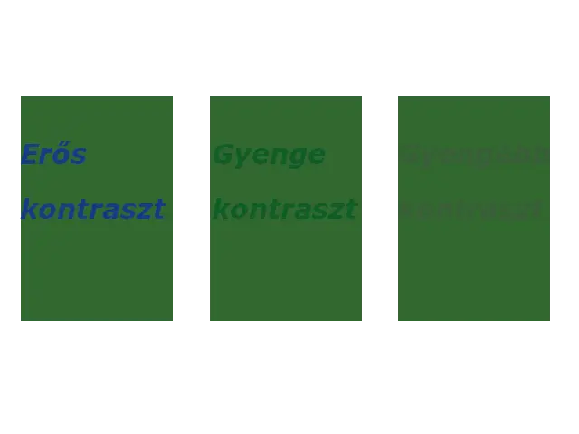
Using Contrast
One important colour theory principle concerns the use of contrast. The greater the contrast, the more two colours stand out from each other.
When evaluating contrast, it is important to consider not only the colours (e.g. blue and green) but also their tone. Two different colours with even tones do not create a high contrast.
The examples below do, of course, contain some exaggeration, for example in the last sample, the opacity has been reduced for the weaker contrast, but there is a deliberate intention here. I've seen 1-2 pages before where this was played with and almost similar results to the example below were achieved - I guess not intentionally.
However, it's also worth bearing in mind that what is visible on our monitor setting may not be on someone else's, so if possible, avoid or rarely apply transparency to text only. If you do, do so for very different, contrasting text and backgrounds.
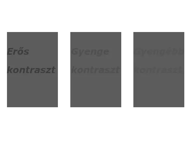
A simple trick to determine the contrast level of two colours, converting them to grayscale makes the contrast difference much more obvious (see below).
If possible, use a contrast checker! (Whether you use the previous Part 3 of our course mentioned coolors page is also suitable for this!) - Sometimes this part is done out of routine, but you can also improve the contrast a lot by paying attention to this. In this tools, coolors and similar page online solutions can be of great help. That's why they exist, let's use them!
Contrast is a key element of our appearance!
Generally speaking, when designing websites, you want to use high contrast colours for better readability. For example, white text on a dark background, or vice versa. Contrast draws attention and can visually highlight certain important elements.
But too much colour contrast on a website can be hard on the eyes.
Check out this entryto learn more about colour theory and how to apply it to website design.
Use colour psychology to convey brand messages and values.
Colour psychology refers to the influence of colours on our feelings, emotions and behaviour. Although somewhat subjective, colour psychology can help us to subconsciously influence in a meaningful way the people who visit our website, their reactions to the site, their feelings about its content. This makes it an effective tool for design and marketing.
Colours evoke emotions
People are attracted to certain colours in part because they feel as if they can feel those colours and it affects their emotions, attitudes and even their mood.
On the other hand, colours can also trigger a visceral reaction that makes someone avoid contact with them.
If all this sounds a bit incomprehensible, it's because there's an important piece of the puzzle missing: context.
In a certain context, the colour red can make us feel fear and anxiety. In another, it can evoke passion and excitement.
If the colour is website design to convey a certain emotion, it should fit seamlessly with the other elements of the page, such as typography, images and text. With this in mind, let's review the most common associations between colour and emotion.
Common colour schemes
The colour matches below can be used as a reference when considering which colours best represent a particular brand.
What should your target audience feel when they encounter your brand website?
What steps should you take?
In the right context, colour can mean the difference between a committed potential customer and an uninterested passerby.
- Red: passion, power, love, danger, excitement.
- Blue: calm, confidence, competence, peace, logic, reliability.
- Green: health, nature, abundance, prosperity.
- Yellow: happiness, optimism, creativity, friendliness.
- Orange: fun, freedom, warmth, comfort, playfulness.
- Lila: luxury, mystery, sophistication, loyalty, creativity.
- Pink: care, gentleness, honesty, warmth.
- Brown: nature, security, protection, support.
- Black: elegance, power, control, sophistication, depression.
- White: purity, peace, clarity, purity.
Create a colour palette
Now that we have a better understanding of colour theory and colour psychology, we are well prepared to create a colour palette for our own or our client's website.
The colour palette is worth thinking about and planning in advance. These colours can be set in hexadecimal, RGB - or whatever is most convenient for you. These will be needed later on for brand building, logo design, marketing elements, company marketing and company websites.
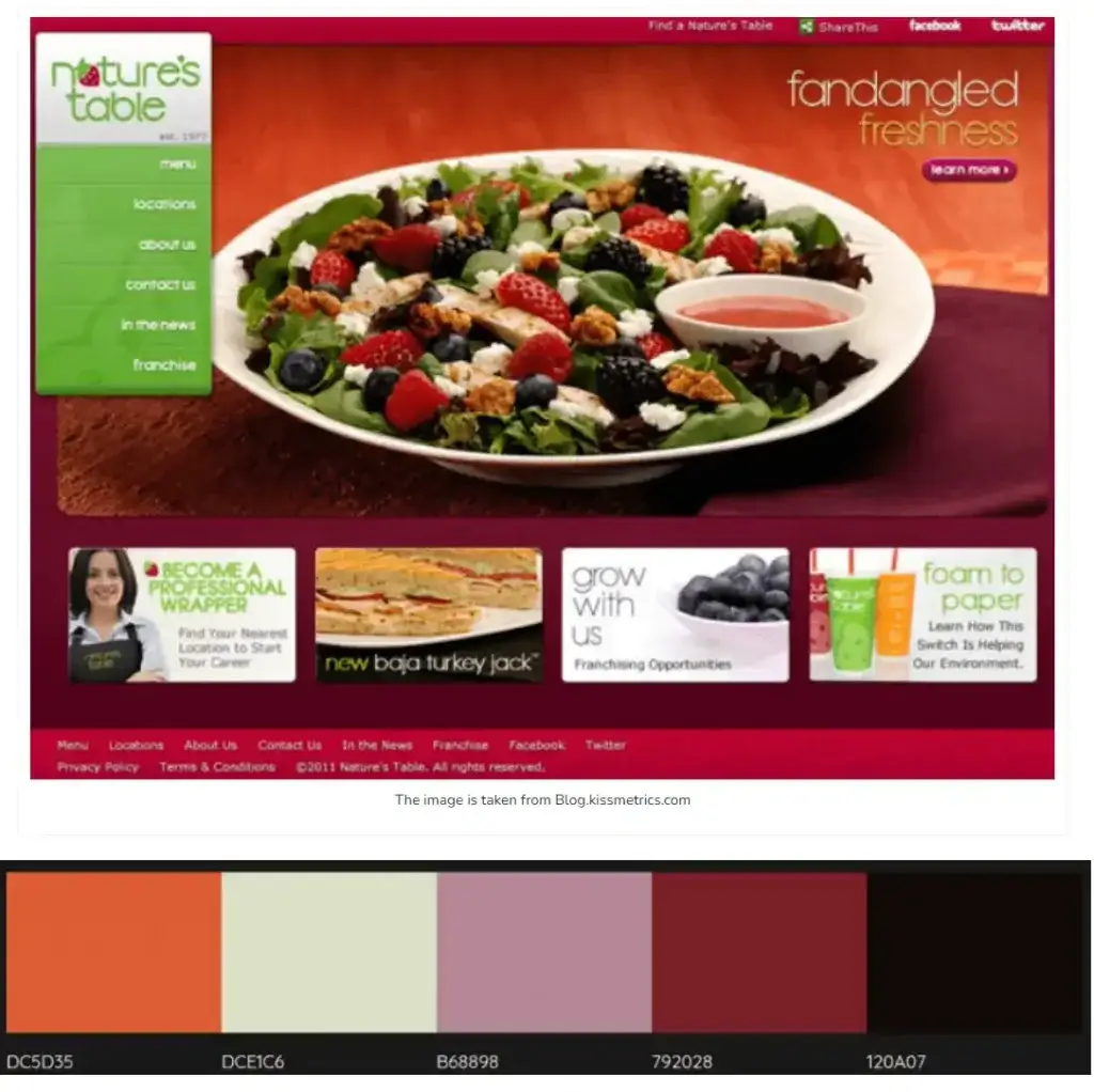
Colour palette
So the colour palette. The first colour you choose should be the primary colour of your brand. Not to be confused with the primary colours in the colour wheel, in this case "primary colour" refers to the main colour in the palette.
This is where the psychology of colour really comes in handy.
Below are examples of brands that have effectively used colour psychology to select their primary brand colour.
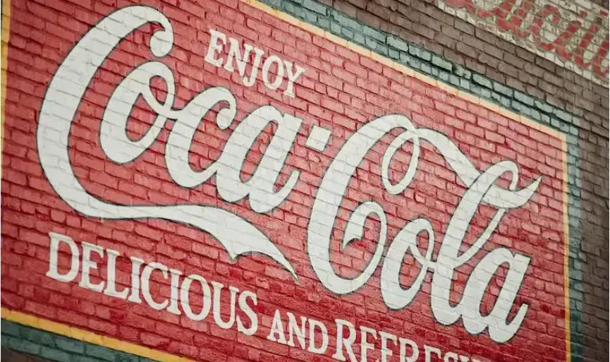

Coca-Cola proudly displays its bright red colour. Source: Brands & Products | The Coca-Cola Company ; Coca-Cola Global Home | Site Locator Coca-Cola Global https://www.coca-cola.com
To repeat an earlier example, The Coca-Cola Company is a brand that has taken its primary colour, bright red, and used it as its primary colour. This colour is used throughout their website and in their advertising. The only other colours in their palette are black and white, which they use for text.
Red is associated with feelings of excitement, love and warmth.
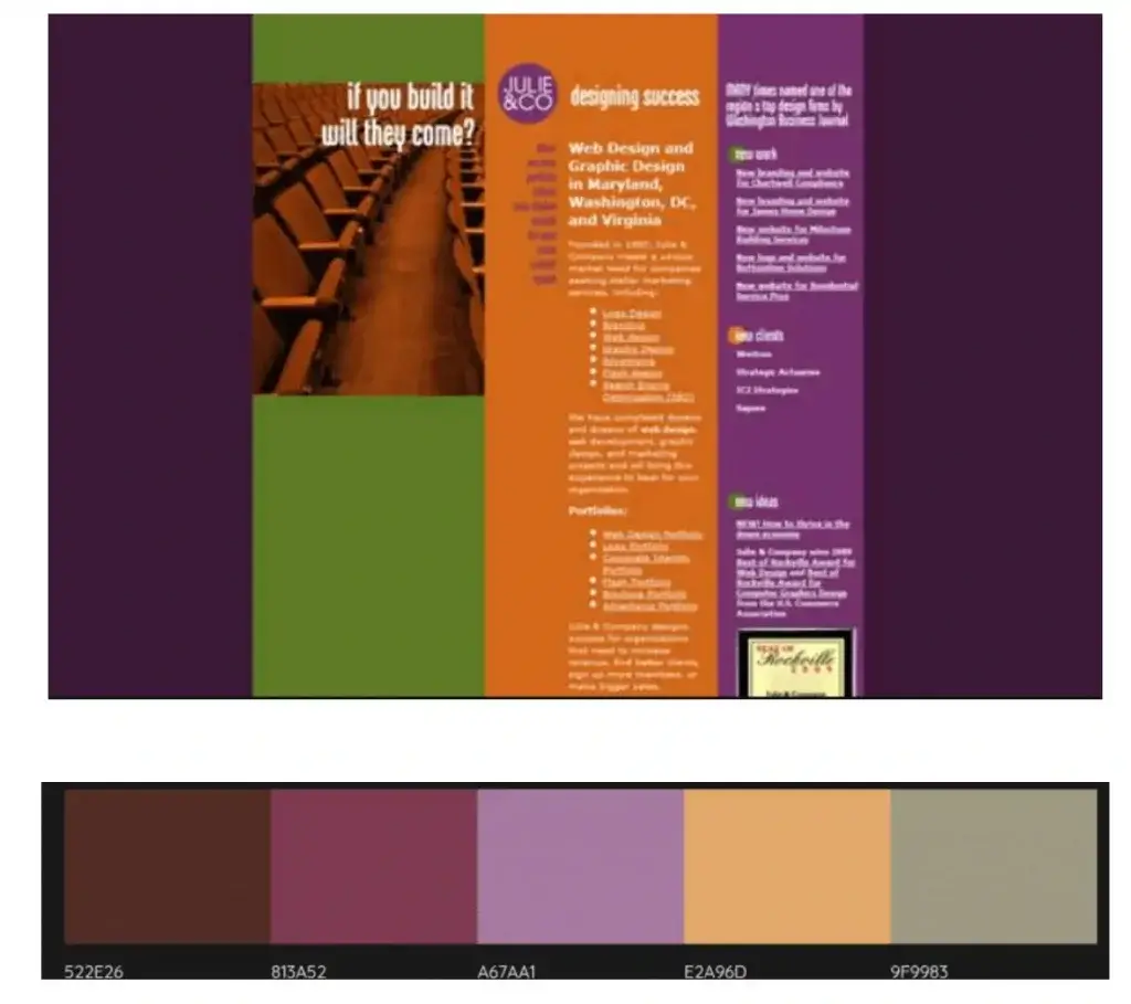
Colour palette types
There are five main types of colour palettes: analogue, monochrome, trio, complementary and split complementary. Any of these can be used to create an effective colour palette for a website. Below are some examples of how each colour palette type is used in website design.
Analogue
Analogue colours are colours that are placed next to each other on the colour wheel. This type of palette can look very nice because the colours match each other very nicely. However, the effect too can be subtle and can prevent any one element from protruding far enough.
The analogue colours are very close together on the colour wheel.
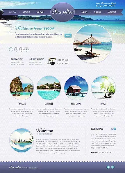
Minimalist design with analogous colors - Source WP templates - Analogous Color Palettes in Web Design | EntheosWeb Blog
Monochromatic
The monochromatic colour palettes are based on a single colour, which is combined with different shades. Like analogue palettes, monochromatic palettes can be very pleasing to the eye.
In web design, however, it is worth adding a complementary colour to the monochromatic palette to draw attention to important elements.
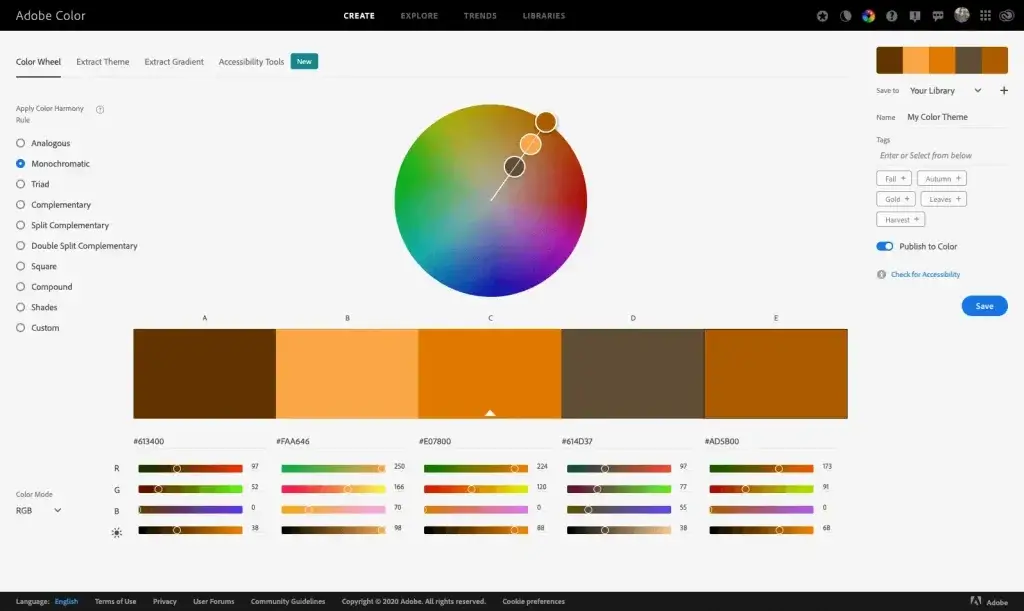
Monochromatic colours are mostly associated with changes in brightness.
Triad or triad colour palette
The triple colour palettes consist of three colours, equally spaced on the colour wheel, forming a triangle. This type of colour palette is a bit risky to use when designing websites because it can look noisy. However, depending on the context, a triple colour palette can be very effective for youthful, playful and/or artistic brands.
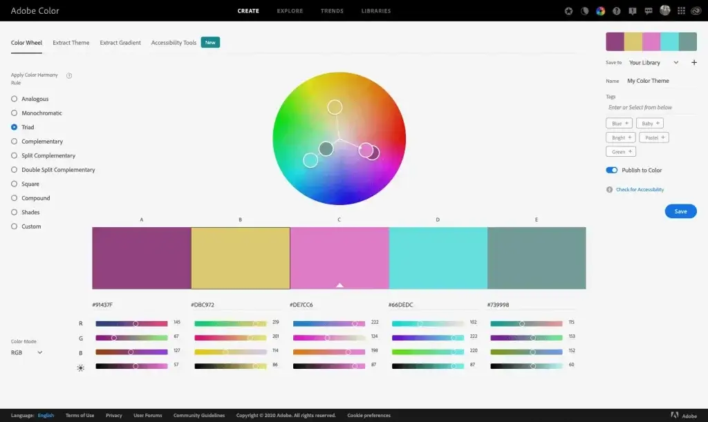
The triad colours are evenly distributed on the colour wheel.
Source: smi.com
Complementer, Additional
Complementary colour palettes contain colours at opposite ends of the colour wheel. These palettes are very effective in web design because they create visual balance and tension.
But if the colours are used in the same way, the tension can be too great. Instead, choose one of the complementary colours as the primary brand colour and use the other as an accent colour or complementary colour.
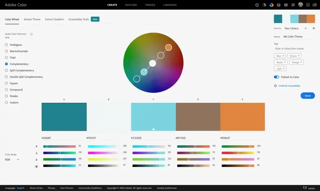
The complementary colours on the colour wheel are opposite each other.

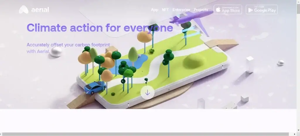
Source: Aerial - Climate Action for Everyone
Divided complementary, Split supplement
Split complementary colour palettes are similar to complementary palettes, but include a third colour that is placed next to one of the complementary colours on the colour wheel.
This type of colour palette is also very effective for website design and can add more visual excitement without creating too much noise.
A lot of premium brands use this colour combination!
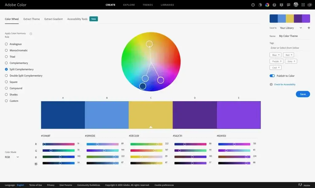
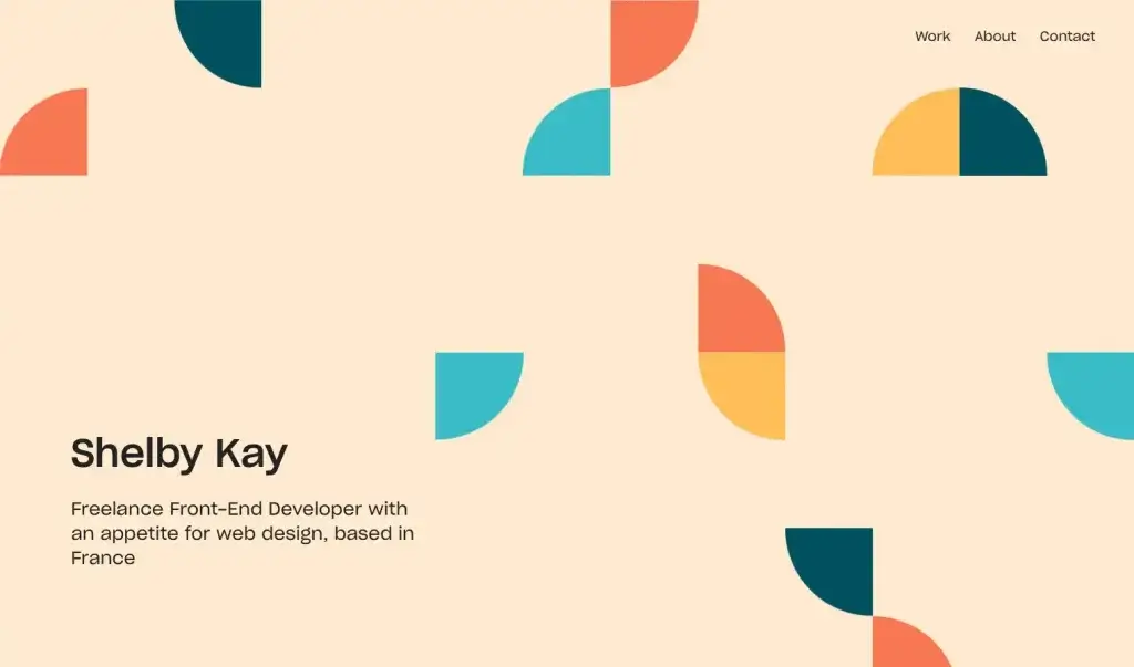
Source: Shelby Kay
Tetradic/double-complementary model (rather interestingly) - not part of the five main types
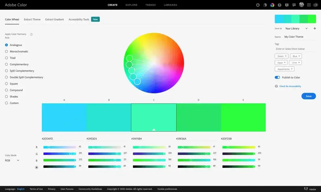
How to use colour palettes in website design
You can use various online tools to create colour palettes. One of these, which you can see in the screenshots above, is the Adobe Color. With this tool you can play around with the colour wheel to create a custom palette using any of the five colour palette types listed above.
You can either upload an image from which you can extract the colours, or click the Explore tab to browse pages and pages of colour palettes.
Primary, secondary, accent colour, 60/30/10 rule
To start with, we suggest choosing three colours for the palette: a main (or primary) colour, a secondary colour and a accent color/Emphasis added. Then apply the 60/30/10 ruleto use these colours in the design of the website. According to this rule, the colour used should be 60%-a for the primary colour, 30%-a for the secondary colour and 10%-a for the accent colour. Remember that black and white are also considered colours.
Regarding the 60/30/10 rule, it is important to note that this is more a guideline than a rule. For example, you may want to include more than three colours in your palette.
The main lesson is to focus on the primary colour and use the other colours to separate elements, create contrast and highlight important features.
With our courses, you can learn the basic use of colour in website design
In this post, we've covered the basics of colour theory and colour psychology and how to use them to create effective colour palettes in website design.
But as we know, colour alone is not the functional web design is the key to creating high-quality, high-value websites for customers, we need to combine colour principles with strategy, typography, layout, UX and much more.
Source info and pictures from Flux Academy