
Using Bootstrap in WordPress: A Beginner's Guide
The source, originally written in English by Deanna McLean (Elegant Temes).
The Hungarian translation was made by: WebServe

Using Bootstrap in WordPress - A Beginner's Guide
WordPress and Bootstrap are both popular web design platforms, which are often not considered compatible. Bootstrap has become the CSS platform of choice for developers because it makes it easy to create responsive websites. In fact, more than 70% of websites on the web are designed using Bootstrap.
Code anything into your responsive framework to create a unique, mobile-friendly Create a website. With more than half of all users accessing the internet via a mobile device, it is essential that responsive website should be.
What if we told you that you could use Bootstrap and WordPress together? Well, good news, it can be done. There are several ways to use Bootstrap in WordPress, including WordPress Bootstrap plugins that can add Bootstrap blocks to your WordPress editor.
We'll show you how to use Bootstrap in your WordPress application, and we'll also show you how to use it.
What is Bootstrap?
The Bootstrap was created by two Twitter experts, Marc Otto and Jacob Thornton. With so many people accessing the internet via their phones, they wanted to develop a framework that would focus on mobile users. Because of this, Bootstrap is very popular among web developers. A for mobile-centric, responsive website design Bootstrap uses a grid or column structure that adjusts page settings at certain breakpoints or screen resolutions.
Bootstrap consists of HTML, CSS and Javascript. It is a free and open source framework that allows users to add any HTML or Javascript components they want. In fact, there are many Bootstrap developers who create and sell various components on several marketplaces to help beginners develop their own websites. Like WordPress, Bootstrap is also very popular and allows you to create beautiful designs.
The benefits of using Bootstrap
In addition to being targeted at mobile devices, Bootstrap is fast. It's a CSS framework, which is different from a CMS. So it doesn't have the amount of code that some CMS and which can significantly slow down your website, for example for a Joomla or WIX website.
Although there are perfect and quick solutions to the latter - such as the WordPress-which are still extremely fast, often resulting in much faster websites and page loads than custom-built websites with only the minimum necessary code.
Another advantage is the browsing capability. It works instantly with Chrome, Safari, Firefox and other browsers. Bootstrap does not require webkit CSS rules to work - making it an excellent choice for cross-browser compatibility. In addition, the framework is easy to use. Anyone who knows CSS and HTML can work with Bootstrap.
Last but not least, there is a large community around Bootstrap. Users are quick to share their knowledge about features, coding, or any other related issue that a new developer might need help with.
Ways to use Bootstrap in WordPress
There are a few options if you want to use Bootstrap for WordPress website. You can install the script manually, but you will have to do most of the coding yourself to bring it to life. Second, you can use a pre-built Bootstrap theme under WordPress. You can choose from a number of themes, but choosing this option can make it difficult to get your website to look exactly like the theme. There won't be many options to make it look less overly templated and cobbled together unless you code your own page templates to change all that. And finally, you can use a WordPress plugin to build your website using Boostrap.
WordPress and Gutenberg
In recent years, WordPress developers have started to release various Bootstrap plugins that can be used within WordPress. These extensions are starting to become more common, especially since the release of Gutenberg Blocks. By using a WordPress Bootstrap plugin, you can bring the best of both platforms together. Before we dive deeper into what you can do with these plugins, let's expand a bit on the other options available to you to bring your Bootstrap project to life in WordPress.
Manual installation of Bootstrap
If you don't want to use a plugin, you can always build a your website or WordPress website manually using Boostrap. To do this, you need to add a link reference to Bootstrap in the WordPress for your website in the code header or header. You may need to add a code snippet extension, such as Code snippets or any similar extension, depending on the theme you are using.
The CDN link in the site header to Bootstrap's external style sheet will look something like this:
01 | <link href="https://cdn.jsdelivr.net/npm/[email protected]/dist/css/bootstrap.min.css" rel="stylesheet"> |
Be sure to check the Bootstrap website to make sure you are using the latest script to take advantage of the latest release available to you. Note that you can build your own WordPress theme that includes Bootstrap, but it will require quite a bit of work on your part. This would involve modifying the basic pages - index.php, wp-admin.php and others. For this writing, we will be using bootstrap plugin as it will make the implementation much easier and smoother for most.
Using Bootstrap WordPress theme
Among the WordPress templates, there are quite a few free Bootstrap WordPress themes available. All of them are fully responsive and built entirely using bootstrap.
Let's take a look at some of the more popular choices.
Shapely

A Shapely is the most popular Boostrap WordPress theme. It is a one-page design that comes fully integrated with Bootsrap. There are several homepage widgets and it supports major WordPress plugins such as WooCommerce, Jetpack, Gravity Forms, Yoast SEO and much more. Thanks to Boostrap integration in the Shapely 100% mobile responsive design.
Illdy
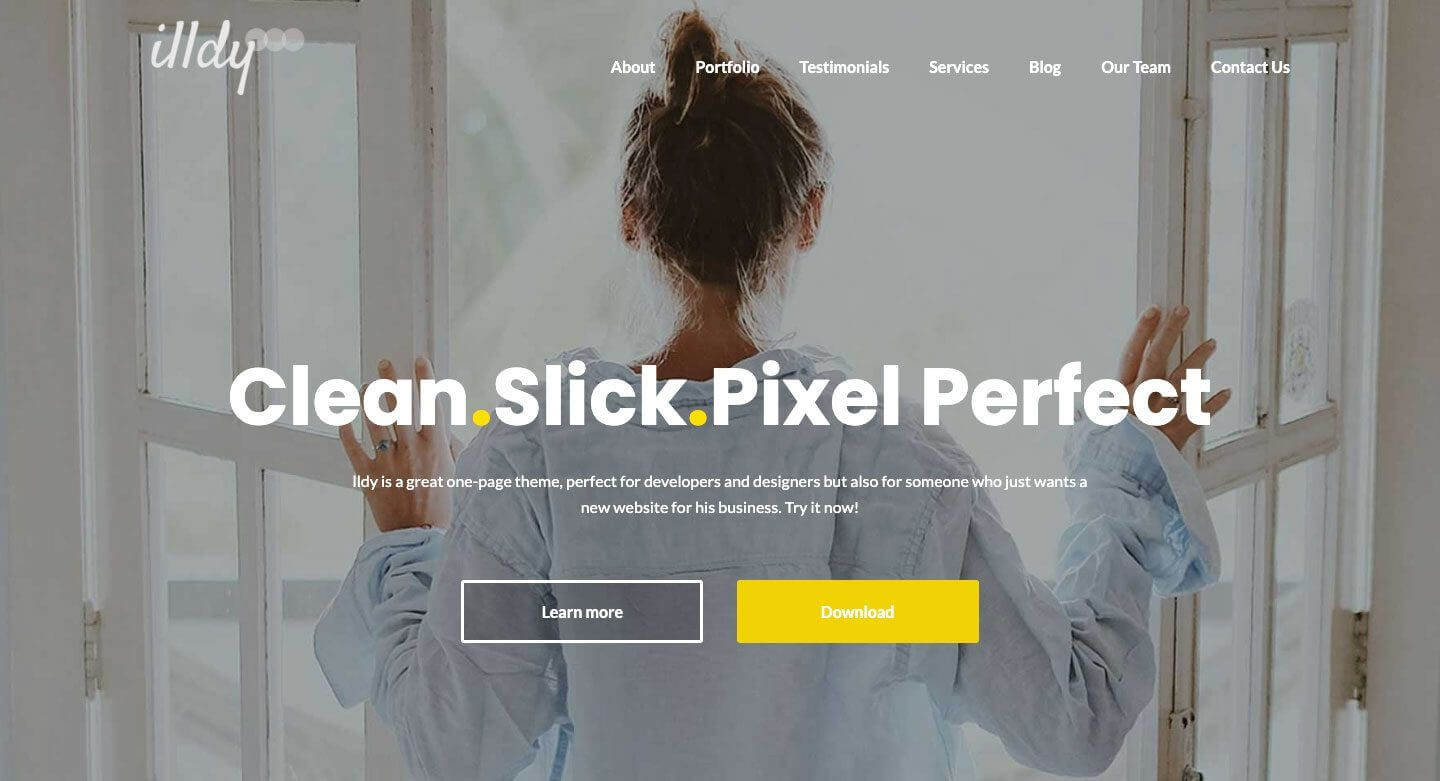
The Illdy is a multipurpose Bootstrap WordPress theme that uses a front-end visual editor. Like all Bootstrap-based themes, Illdy is fully responsive. The built-in portfolio feature makes it suitable for creative businesses.
Activello
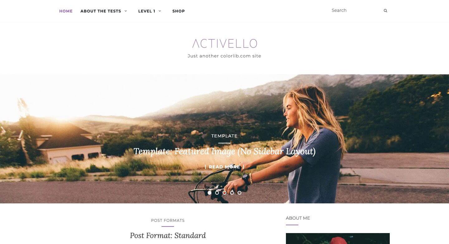
The Activello has a full-screen slider on the home page, which gives a stunning look when you first visit the site. It's great for bloggers and supports the most popular WordPress plugins. In addition, Activello is compatible with Schema, which makes this theme very SEO-friendly, search engine friendly.
Using WordPress Bootstrap plugin
To demonstrate this, we will use a plugin to build our Bootstrap site in WordPress. Both plugins we will talk about allow you to use Bootstrap Gutenberg with blocks, but one offers an easier route than the other.
Bootstrap Blocks plugin
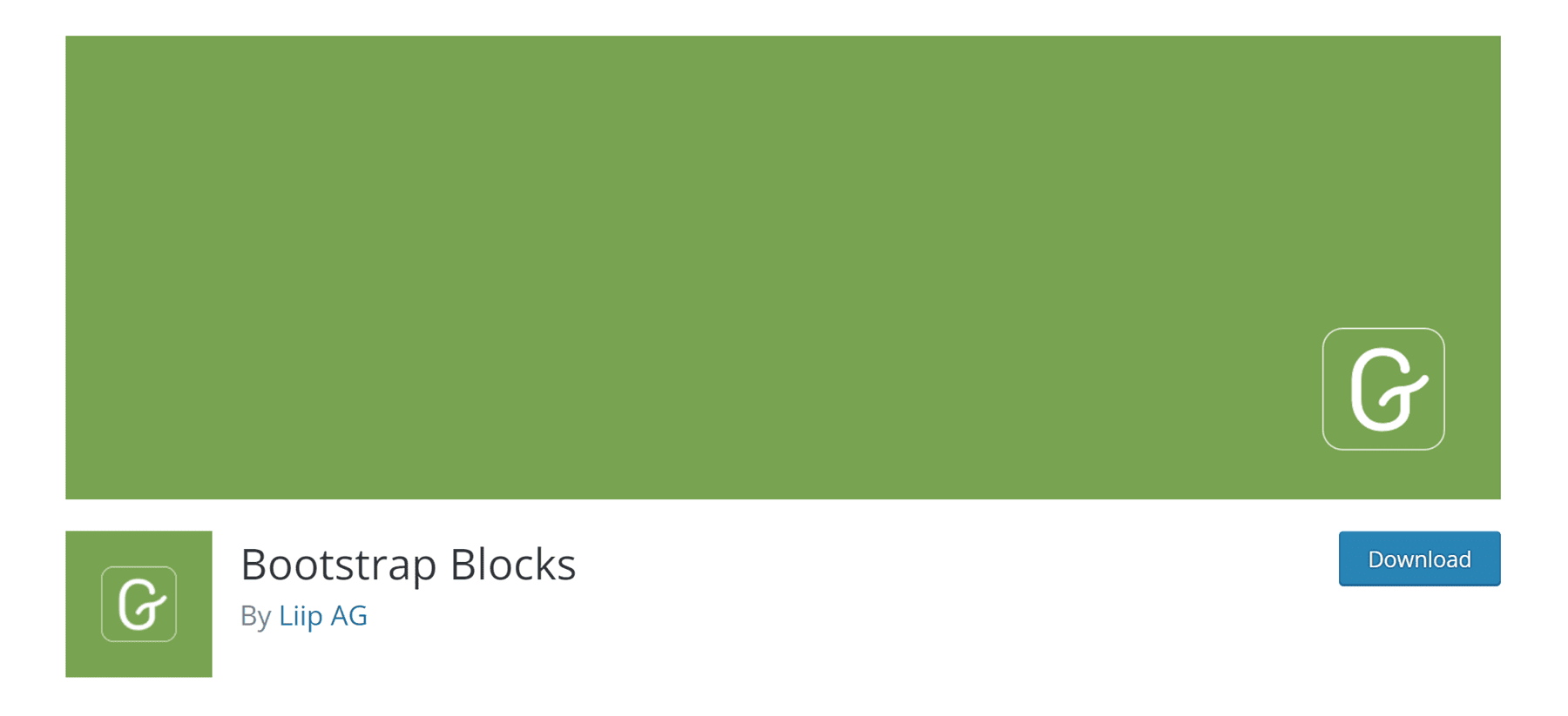
A Bootstrap Blocks is a WordPress plugin that adds Boostrap Gutenberg blocks to the WordPress editor. The plugin requires quite a bit of customization to fully integrate with WordPress. It does not include the Bootstrap library in the plugin. If you want to use this feature, you will need to manually add code to your functions.php file. This plugin is better suited for WordPress developers who have a sufficient amount of programming knowledge.
If you already know how the basic WordPress files work and have a good idea of Bootstrap, this might be the way to go. However, there is one thing to keep in mind about this plugin. You only have access to a few components - containers, rows, columns and buttons. If you want a more robust option without a lot of hassle, you should probably consider a different approach.
All Bootstrap Blocks plugin

From All Bootstrap Blocks extension has some really nice features. Not only does it incorporate the Bootstrap framework into WordPress for you, but it also offers 37 pretty cool blocks for Gutenberg blocks in addition to. You get features like columns and rows - which are the basic blocks of Bootstrap. In addition, there are modals, accordions, content maps, icons and much more. It's almost like having a fully functional theme, just with the installation of a plugin. There is some learning required to get things to look right, especially if one is used to, for example, a drag and drop visual builder. However, if you hand-code with divs and columns, it will be a breath of fresh air.
Using Bootstrap in WordPress Website design (step by step)
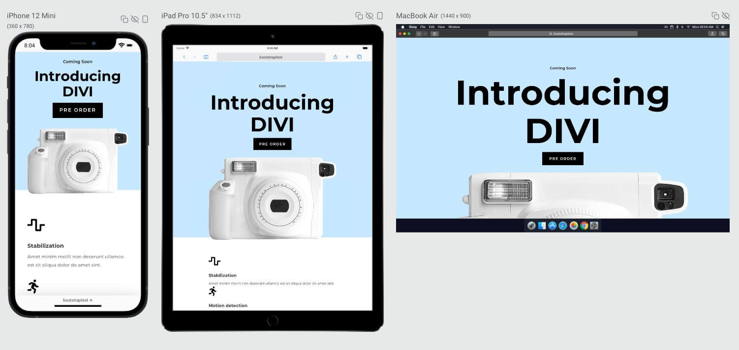
For this tutorial we will build a site in WordPress using one of WordPress' basic built-in themes, the Twenty Seventeen theme and the All Boostrap blocks plugin. For the sake of example and visuals, the following sample pages are available with a subscription to Elegant Themes, Divi - you can also order from us at a discount - will be modelled on the basis of the camera product page.
1. Modifying the CSS of the Twenty Seventeen theme for Bootstrap
Now, if you know anything about the Twenty Seventeen WordPress theme, you'll see that by default it has a large header image followed by a two-column layout. For our page layout, this simply won't work. We need to make a few changes to make our site look like the product page for the camera.

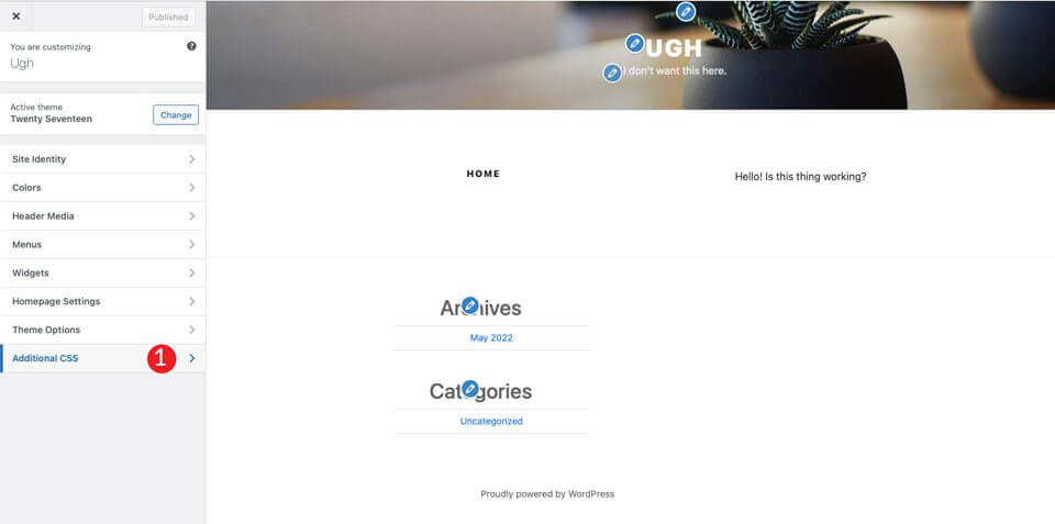
The first thing we need to do is remove the header image that comes as standard with the theme. To do this, find the "Customize" option marked with the number 1 in the black admin bar.

When the screen refreshes, click on the Additional CSS section.
Finally, add the following css code:
01 02 03 04 05 06 07 08 09 10 11 12 13 14 15 16 17 18 19 20 21 22 23 24 25 26 27 28 29 30 31 32 33 34 35 | /*Make page full width*/@media screen and (min-width: 1200px) { .wrap { max-width:100%!important; padding:0; }}@media screen and (min-width: 1200px) {#primary .entry-content { width: 100% !important; }}.site-content { margin:0!important; padding:0!important;}/* Hide Menu Bar */.site-branding { display:none;}/* Hide Page Title*/.page .panel-content .entry-title, .page-title, body.page .entry-title { display:none;}/*Hide Site Footer - Website hide footer*/ .site-footer { display: none; }} |
This will change some things. First, the width of the content will fill the entire width of the page. Second, it removes the margin and padding from the page. Don't worry, Bootstrap will handle these. In addition, the code will remove the header and footer of the web page. Finally, it hides the name of the page from our soon to be released masterpiece.
Note: If you want to create a footer for your site, you can skip the site-footer css rule above.
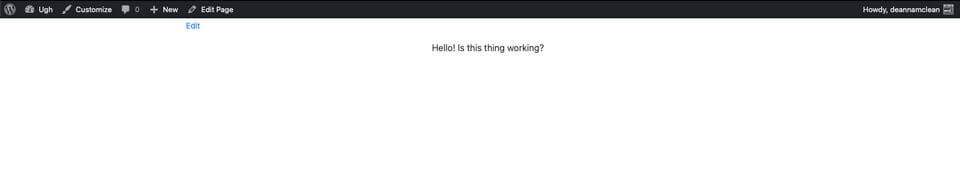
After you click on publish , the page should look like this:
2. Install and configure the extension
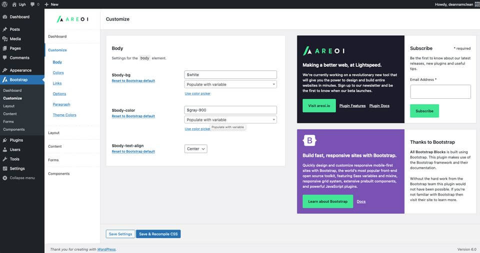
Now that our theme page is ready to go, you need to install the All Bootstrap Blocks extension. After installation and activation, you have quite a few customization options to choose from. You can adjust the colours, typography, links and much more. To get started, go to Boostrap > Customize. You'll find tabs to customize layout, content, create forms and components.
3. Create a page layout with all Bootstrap blocks
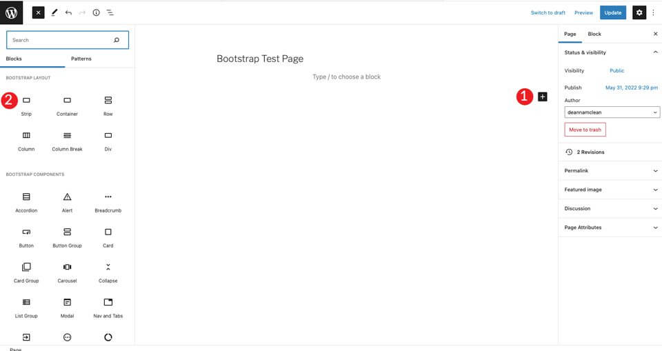
The first step is to create a new page. After creating the page, start with a ribbon page (Strip) add this to the first block of the page. This creates a section that adds a container, row and column.
Click the+ button, then click browse all (browse allThis creates a sidebar with the available modules.
Under the bootstrap layout, select Strip function.
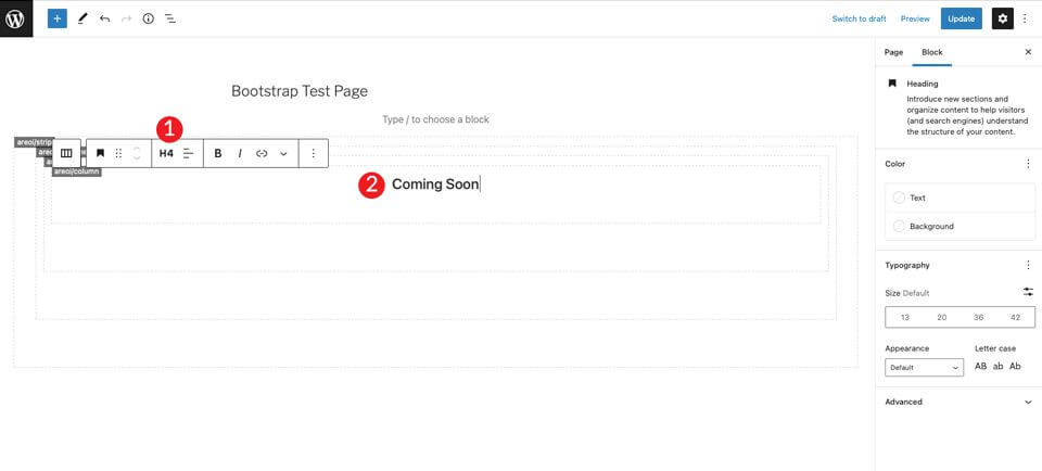
When adding content, you will see that a container, row and column are visible inside the strip/strip. Then select the title bar and set it to H4.
Click + to add another address bar under the H4 label. Set it to H1, then set the size to 7em.
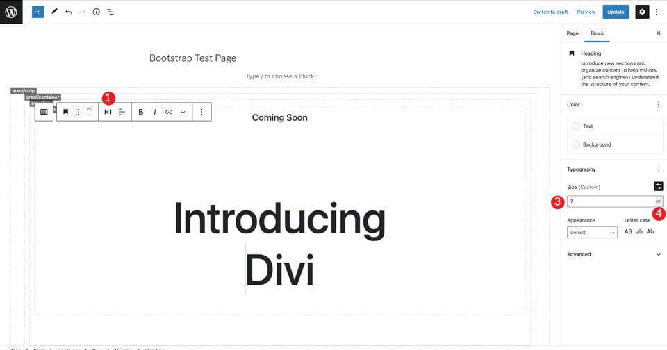
Then add a Bootstrap button/button by clicking on the + button. Type the button in the search bar. Set the text of the button. Then set the style to dark, the size to medium, and leave the text break as default.

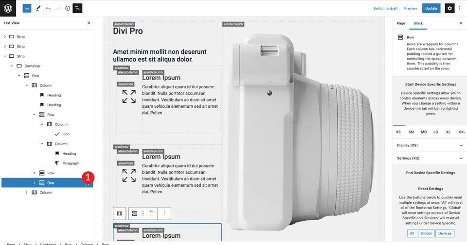
For the last item in the section, select an image by clicking on the + button. Add any image you like, but right-click on the Divi layout example, and save the large camera image to use in the layout. Click the upload button to insert the image. If you don't have a Divi licence, you can get it from us at a discount, but you can also try, test and experiment with other images.
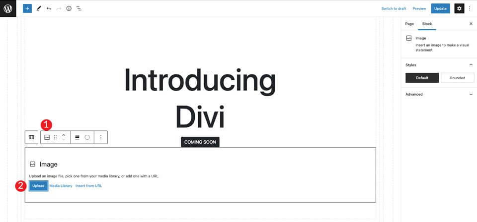
You will see that the image is directly below the button, but there is not enough space between the two. To solve this problem, add a spacer, space filler/spacer. Click on the column below the image to display + . Add the spacer and give it a height of 30px. Then click the up arrow to move it over the image.

4. Setting up the Container
After saving the page, open it in a new tab. You'll notice that we still need to adjust the background colour of the section and add a little padding to remove it from the top of the page.
Go back to the backend and click on the container. You can do this by selecting the menu at the top of the page , or by clicking on the container in the page builder. Then turn on the Display Background. Set the horizontal alignment to center , then set the color #c6e8ff value.
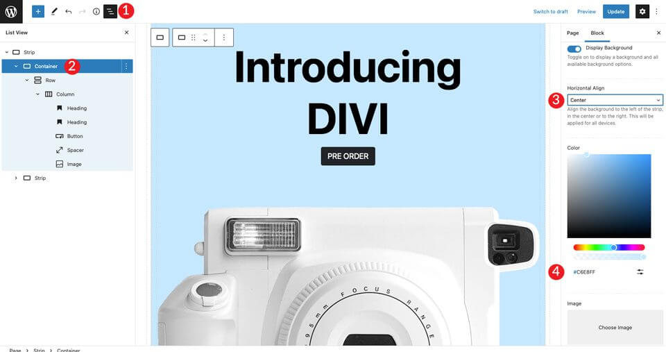
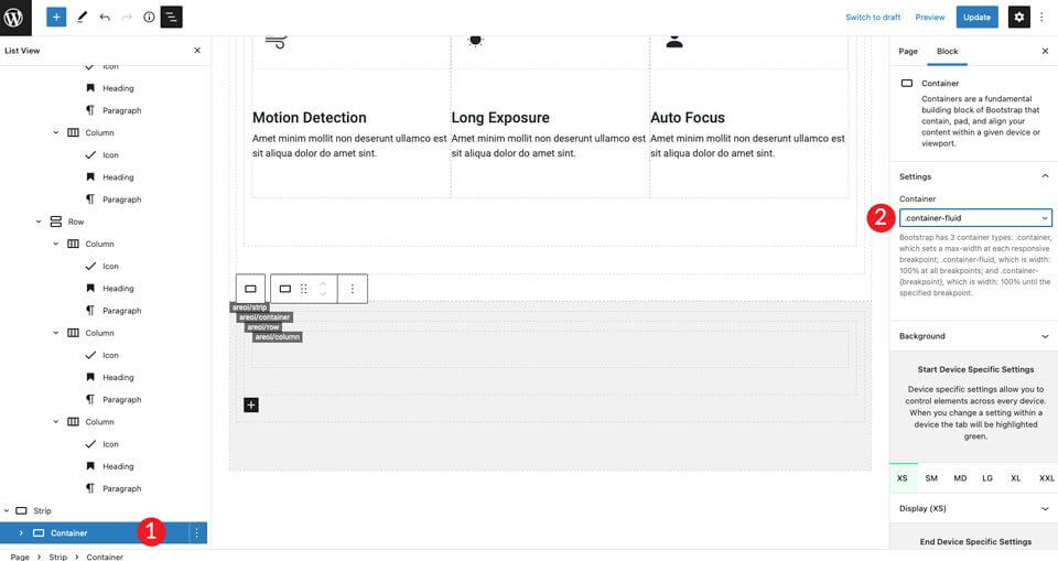
Then set the container to container-fluid status. This way the container covers the entire width of the page.

Finally, we need to add some padding to the line. To do this, click on the Display Set the padding to 50px at the top (Top) and bottom (Bottom).
5. Create the following section
Then we create a section with icons and text. To start, add another Strip-the first under the + by clicking on the button. The next step is to insert an icon into the layout. Click on the + button, then type icon in the search bar.
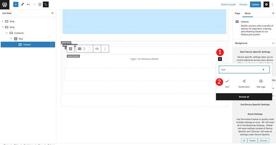
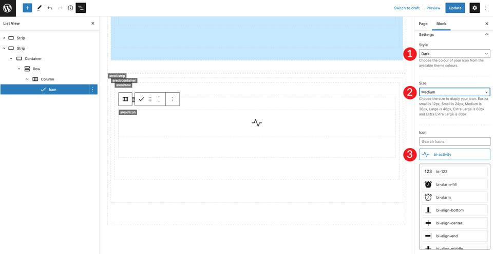
Select the icon module. Click on the settings drop-down menu to display the icon options. Select the dark style (Dark), then set the size to Medium. Leave the default icon bi-activity state.
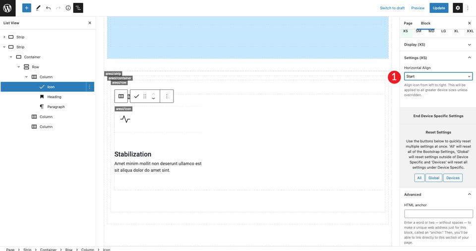
Under icon settings, set the horizontal alignment to Start-ra. This will align the icon to the left to match the rest of the column.
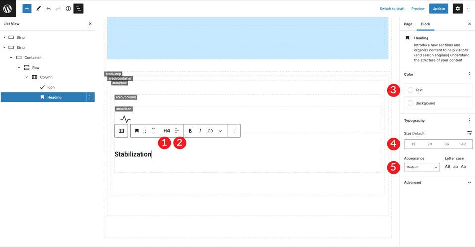
Add an H4 address range. Then set the text alignment to left, the color to dark, and leave the size as default. Finally, select the medium to display/Appearance.
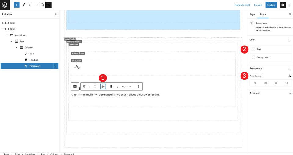
Click + to add the paragraph text. Set the alignment to left, the colour to dark and leave the size as default. Enter text, whatever you like.
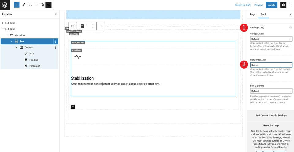
Save the page and view it in a new tab. You will notice that there is no space above the icon. To fix this, click on the row settings to add 50px padding to both the Top and Bottom.
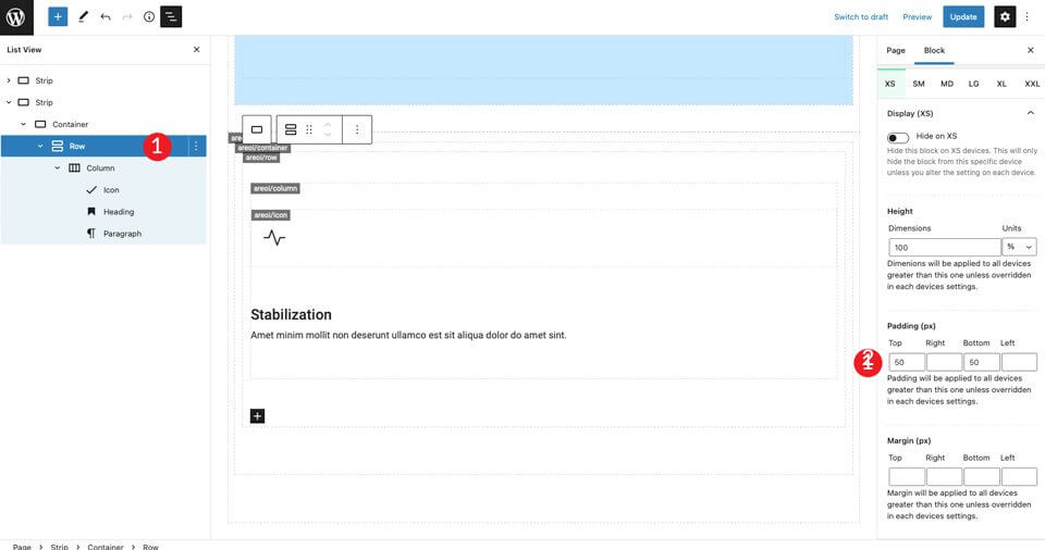
Finally, in XXL Settings, set the horizontal alignment to the middle. This will centre the content in the middle of the page for all screen sizes.
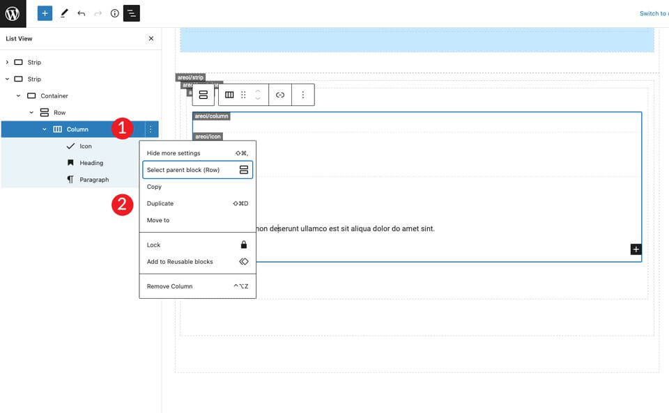
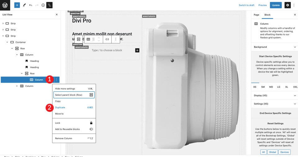
The next step is to duplicate the columns. This is a big time saver. You only need to replace the icon and the text. To do this, click on the column options and then on duplication Repeat this step once more to get a total of three columns.
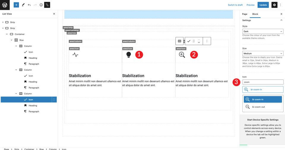
Now there are three columns, which are in the middle of the page, with left alignment on the icon and text. Then edit the icon in the middle column. Click on the icon and select bi-lightbulb-fill - fill in the form. For the icon in the third row, select bi-zoom-in Opportunity .
Then modify the headings in the second and third columns.

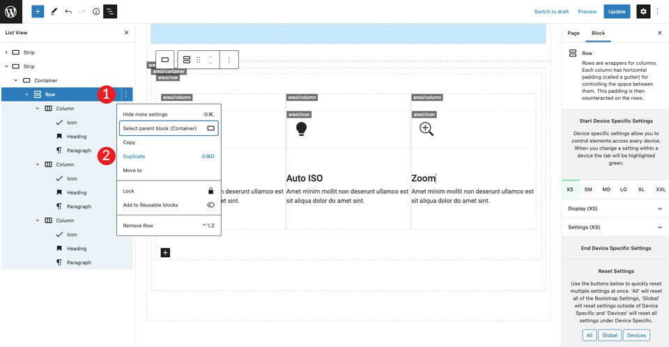
Duplication of the first row
Now the first set of icons is ready. Copy the row to create the second row of icon boxes.
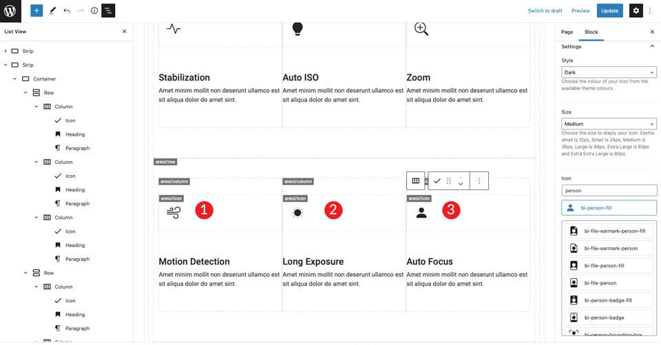
Repeat the above steps for all three columns of the headings, as well as modifying the icons. For the icon in the first column, use bi-wind. The icon in the second column is for bi-brightness-lo-fill and the third icon is for bi-person-fill . The last step in these is to modify the headings.
6. Create the last section
Start a new Strip by adding. Under settings, change the background colour #f0f0f0.

Adjust the width in the container settings container-fluid-Also add 50px top and bottom padding to the row.
Copy the single column to make another column. Then adjust the column width of each column to match the size requirements of the layout. For the first column, make it 5 column widths.
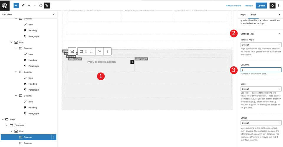
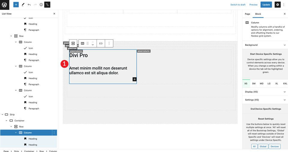
For the second column, leave the column width as it is. Then add an H2 header and then an H4 header. Set both to left alignment.
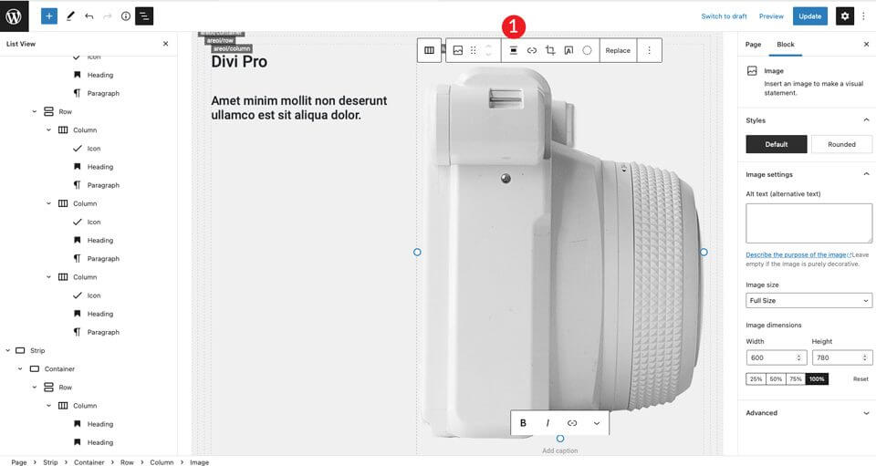
Add a picture to the right column. Adjust the image so that it is centered.
For the next step, insert two columns under the headings of the left column. Add the row module (Row).
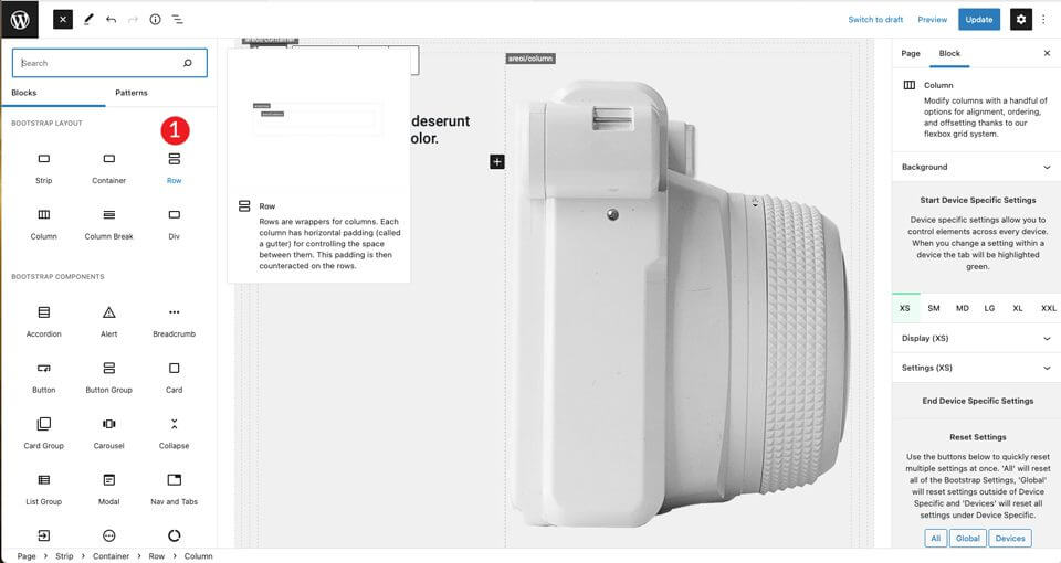
Duplicate the column in the newly created row.
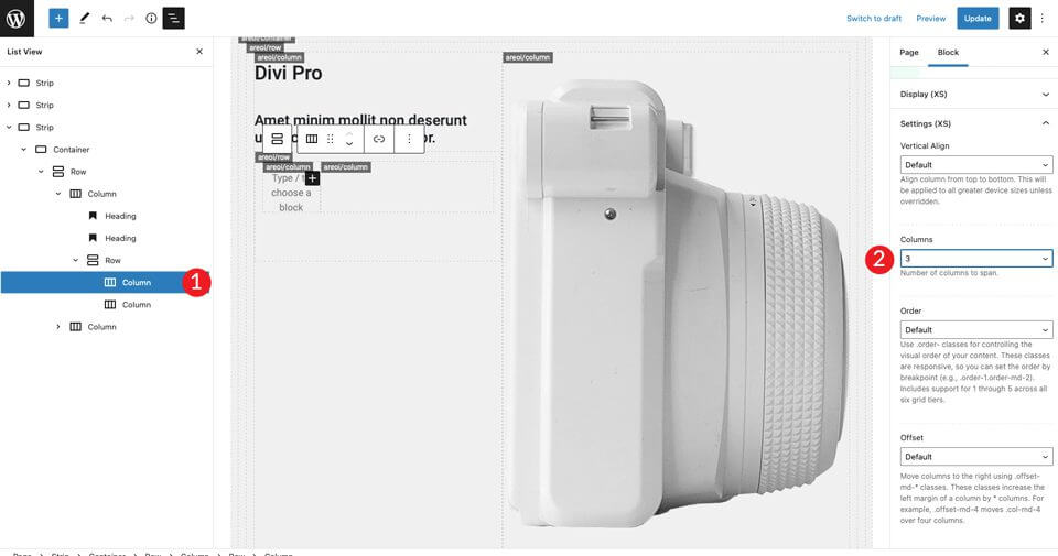
Click in the first column on the left and set the size to 3.
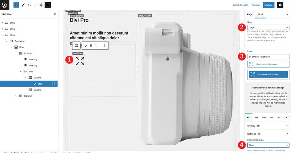
Now that our column structure is in place, we can add an icon. Select the bi-arrows-fullscreen icon and set the size to large. Set the style to dark. Be sure to align the icon to the left so that the horizontal alignment is set to start .
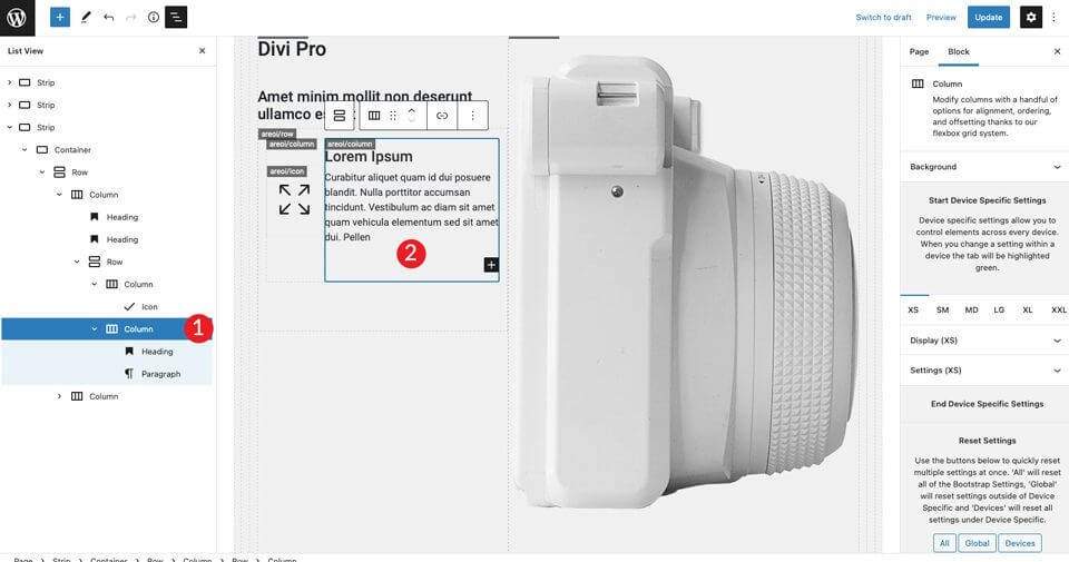
In the right-hand column, add an H4 heading and then a paragraph. Be sure to set the color to dark, then align each one to the left. Add a space filler under the H4 header and set it to 30 pixels high.
Then double the inner row created twice.
The last step is to change the icons in the second and third row. To change the first one, select bi-card-image icon. The second icon is the bi-camera-fill will be .
7. Optimise the site for mobile devices
One of the best things about Bootstrap is that you can easily make your design responsive.
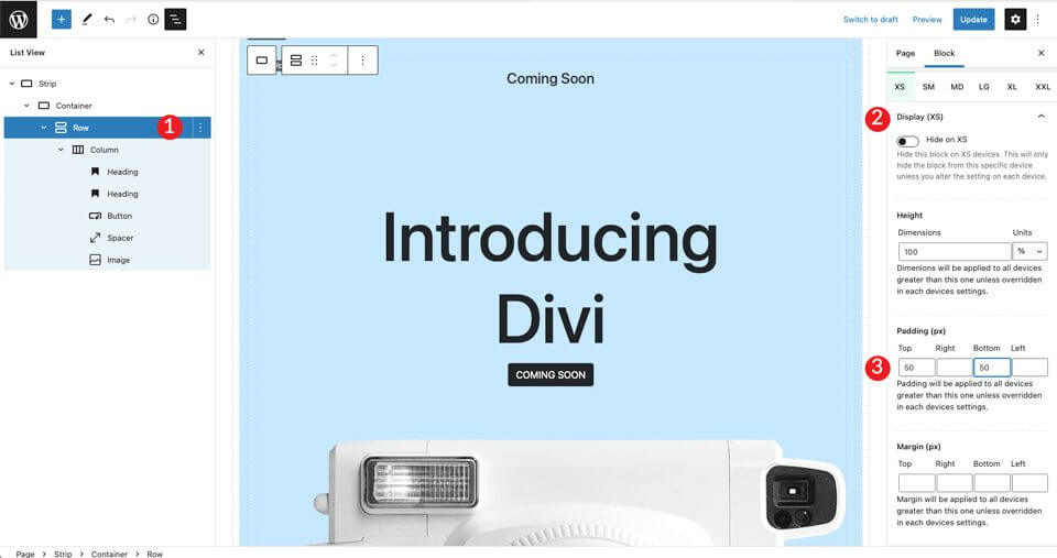
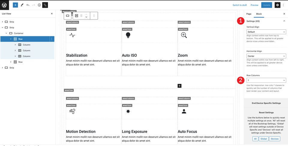
The site is ready, just a few more steps to get it ready for mobile devices. First, we need to tell Bootstrap how many columns our sections should occupy on smaller screens.
The first bar is already set to a column, so we don't need to worry about that. For the second one, we need to make a small adjustment.
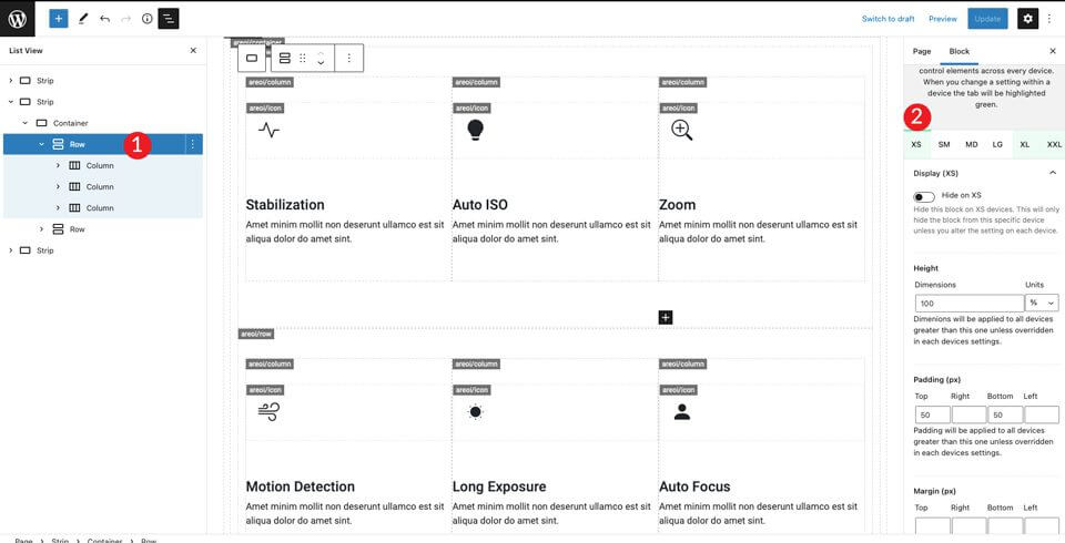
Scroll down to the Display (XS) section and set the columns to 1.
Then switch to XXL and set the columns to 3. This will instruct Bootstrap to place all content in the row so that it appears in one column on mobile and three columns on larger screens.
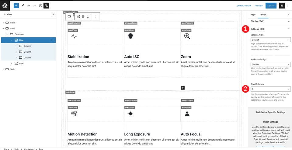
You can adjust the other screen sizes to your liking, but with these settings the layout will look good on both smaller and larger screens.
The final result
The source, originally written in English by Deanna McLean (Elegant Temes).
The Hungarian translation was made by: WebServe


 English
  Hungarian
  German
  French
  Spanish
  Italian
  Dutch
Dutch ") German (Austria)
German (Austria) 
")